Tuesday 30 June 2015

Potential Problems

I have completed a table which documents potential difficulties I may encounter when approaching my design work.  I have commented on how I will tackle these problems.  This will act as a reminder when I conduct my Photo shoot and work on the designs as I will be able to refer back to it.


Monday 29 June 2015

Font and Colour


Masthead Ideas

My masthead will follow the convention of regional magazines by being placed in the left hand corner.  The image will not go over it as this is more common in established national magazines.  These are the ideas that I have in mind at the moment.  They blend a serious tone with a positive one.

North East Film

NorthEast FILM

Saturday 27 June 2015

Research into Institutional Logos

I have researched media publishing institution and presented my findings in a Prezi.  The link to this is here: https://prezi.com/xvcxskjwvqz1/institution-research/

Future Publishing would be the most suitable institution to distribute my magazine as their portfolio includes magazines such as 'Total Film' and 'Digital Camera' which are areas of my product.  My magazine is on film but in terms of film making, photography plays a part in it.  This makes Future Publishing highly applicable to my work.

Evaluation of Target Audience Research

I have conducted surveys and put my findings into reader profiles and audience profiles.  I think that I have found out all of the information I need to feel confident that there is a clear target audience who would read my magazine, be interested by my billboard and view my website.  I do not feel that I need to amend my ideas as the research supports my idea that my target audience would be interested in reading the magazine.

Friday 26 June 2015

Generic Conventions

In this post, I will discuss how I will follow and challenge conventions of regional magazines, billboards and magazine websites.  This is useful as it allows me to see what things it would be wise to follow for my products.  I have done this on PowerPoint.


Time Management 2

Link to Evernote: https://www.evernote.com/shard/s608/sh/899dfee5-2a5d-404a-ad58-f7e96f378169/61499e3adb5505f1e832dba4e6457486

Competing with other Products

I have conducted this task on 'Powtoon'.


Overall, the main competition would probably come from 'The Crack' as it features sections on art, food and drink and books, giving it more on offer to readers.  My magazine will be preferred by film enthusiasts however as it goes into depth instead of including different sections.

Reader Profile

This is my reader profile which shows the interests of my target audience members.  My audience research showed that film magazines are popular and that movie-watching is something many people do in their spare time.  I have also considered that my audience listen to music and use modern technologies to accompany their interest in film.  This helps me with my ideas as it shows me how to design certain elements in relation to reaching the target audience by making it look like a professional regional magazine as opposed to a national magazine that looks average.


Other statistics: 
60% buy 2-3 magazines a month.
50% would pay between 1.00-1.99 a month for a regional magazine.
40% read film magazines as their genre of preference.


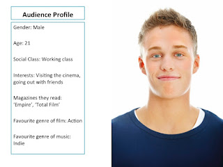
Audience Profiles

These are profiles of the kinds of people who would be in my target audience.  The purpose of this is to help me when in the process of designing as it will remind me of what my audience members want to see and what will grab their attention more.  These people would buy my magazine because of their interest in film and because it would inform them of what they can get involved with in their local area.  The magazine is not too expensive either therefore they could still buy other cultural magazines they would read such as a music magazine or a photography magazine.


Thursday 25 June 2015

Audience Interview

The purpose of this interview is to find out more about my secondary audience.  Before conducting research on my primary audience, I had ideas about their interests but I think that I will find out more from asking a member of my secondary target audience some questions.


Their favourite genre of magazine was health/lifestyle, despite them subscribing to 'Empire' in the past.  This makes me think that they like to read health and lifestyle magazines for 'general reading' and that my product would appeal to them.  They would read my magazine because they expressed interest in going to the cinema, despite never attending any film events like members of my primary target audience.  They are prepared to pay up to £2-£3 for a magazine which is likely due to their interest in reading.  Regarding billboards, they said they would be attracted to one if it had a celebrity on it which tells me that my secondary audience prefer national magazines.  In terms of favourite element of a website, the answer was ease of use which means they are looking for a more simplistic site.

Wednesday 24 June 2015

Primary Audience Research

I have conducted surveys to gain information about the members of my primary target audience.  The participants were all within the target age range of my magazine: 18-30.  I have presented the results in charts using Excel.
When conducting surveys for my AS research, music magazines were most popular however film magazines have received more responses this time which tells me that young audiences enjoy reading magazines of this genre.  As all of the participants of my survey are from the local area, I am confident that my product would sell and that the people who took part in my survey would buy it. 
Colour and images received an equal amount of responses which means that I am going to have to make these features work well together.  Despite text not getting a large response, I will still need to use it professionally in order to give my magazine maturity.

The people who said they watch films/TV will also go out with friends to the cinema.  Viewing movies and listening to music are both very popular activities.  In my AS work I discussed how my target audience would go to gigs and music festivals however visiting the cinema is something that my target audience would prefer. 

As it is not a national magazine I am producing, my target audience is evidently not as willing to pay too much for it.  It is clear however that many people would pay over £2.00 which means that the price of £1.99 would gather more potential buyers.
From the responses to this question I can see that my target audience are regular readers of magazines.  I am confident that if they had a choice of regional magazines to buy, they would pick mine as the surveys have shown that film is a very popular magazine genre.
60% of the participants were male.  I will use my findings from these surveys when producing a reader profile.  I believe that my product appeals to both genders however I will keep in mind more males chose film as their genre of preference whereas more females chose the genres lifestyle and music.


Preparation for Interview

I am preparing to interview a member of my secondary target audience.  To help me with this I have storyboarded an interview with Jeremy Paxman and Russell Brand and looked at the shot types and editing.


I noticed that the shot types in the extract I watched were medium shots and wide shots and the editing style was shot/reverse/shot.  There are only medium shots of Brand, never Paxman, though the wide shots contain both of them.  Here is some information for my own interview regarding the questions and camera shots.

Interview Questions:
1.) What is your favorite magazine genre?
2.) What do you do in your spare time?
3.) Do you ever attend film events?
4.) How much do you usually pay for a magazine?
5.) What attracts you to a billboard advertisement the most?
6.) What is your favourite element of a website?
7.) Do you subscribe to any magazines or have you done so in the past?

Shot List:
Wide Shot, Medium Shot, Wide Shot, Medium Shot, Wide Shot, Medium Shot, Wide Shot, Medium Shot, Wide Shot, Medium Shot, Wide Shot, Medium Shot, Wide Shot, Medium Shot, Wide Shot


Tuesday 23 June 2015

Comparison of a National and Regional Magazine

I have gathered an image of a cover from a national magazine and a regional magazine and I am going to compare them.  This task will enable me to make my magazine suitable for regional sale.
Powered by emaze

Wix Template Research

I will be designing the website using a design tool called Wix.  I have looked at two templates that I think will work well.


This template is very plain but I will be adding images and text to it which will make it look more professional.  Also, this template is more reflective of my magazine front cover.


This template has a powerful image of film reels which may or may not end up looking applicable.  The first template is a better choice as it fits more with the house style of my products.


Target Audience Information

I have scanned this page onto the blog.  This is a typical audience member of my magazine.  Information on my primary target audience is inside the face and information on the secondary target audience is outside the face.


Monday 22 June 2015

Evaluation of Deconstructions

Link to Evernote: https://www.evernote.com/shard/s608/sh/c2f8b09e-512e-4539-93ba-36c68bab3852/95cd5afe870abf92c34c762e7b9b6afb

Survey Information

I will be conducting surveys to find out what my audience's attitude to magazines is.  I have decided my audience will be in the age range of 18-30.  I will conduct paper-based surveys which will be given out to members of my primary target audience however I will also carry out an interview to get more insight into a member of my secondary audience.

Film Magazine Websites

Using PowerPoint I have created a mood board of film magazine websites.


I like the layout of these websites.  It is easy to navigate around them and to find items.  The homepage for 'Empire' is what I am going for as it puts focus on the main stories.  The listings page for 'Cinema Scope' is also inspirational to me because of its helpful layout.  The article page for 'Starburst' in the bottom right hand corner inspires my website article page as I like the layout and composition.


Image Analysis

I have researched images from a magazine front cover, billboard and website.  This has helped me to see how images are used and in what quantity.


Powered by emaze

Website Contact Pages

I am planning to design a contact page as one of my website's hyperlinked pages.  These are some contact pages that are inspiring to my design.


Both of these contact pages have a map with boxes to fill in information either on the side or below.  I will follow the top design closely as I think it looks better to have the information box on the right of the map rather than below it.

Sunday 21 June 2015

Website Inspirations

I have researched images from a magazine front cover, billboard and website.  This has helped me to see how images are used and in what quantity.

Powered by emaze

Billboard Inspirations

I have gathered three billboards which I find inspirational to my design ideas and I will be deconstructing them.


Powered by emaze

Deconstruction of Editor and Feature Page

I have deconstructed an editor's page and a feature page to see how I can incorporate their design techniques into my work.


Time Management 1

Using Evernote, I have created a table which lists what I am aiming to do over the next two weeks.  I will be doing time management posts often.
 

Costume, Hair and Make-Up Inspirations

I have looked at some magazines to study the costume, the hair and the make-up of the models.


The hairstyle in this images is basic as there is no styling needed to distract from the style of the image.  The costume is dark but the white shirt creates a contrast that I want to be used on my cover.


On this cover, the white shirt also creates a contrast though the hair is more stylised.  In terms of make-up, I do not think that I need to apply make-up for my cover image as the noir effect will make its effect less recognisable.

Saturday 20 June 2015

Contens Page Deconstructions

By deconstructing these contents pages, I can develop ideas about what to include on my own.

Masthead: It uses red which is the colour of the 'Empire' logo however it also uses white to distinguish itself from what is on the cover.  This is an interesting idea which I may use myself.
 
Image: The image covers the masthead a bit, giving it dominance and adding to the darkness of the page.  As it is a shot from a film, the professionalism of the magazine is increased.  The image also creates a mystery of what the article is actually about.
 
Colour: Red, white and black gives this contents page a bold look and build the sense that the magazine is sophisticated and well established.  I too will follow the convention of three colours.
 
Listings: The idea of keeping the sell lines to the side is what I am going use, though I will use more than what are included here and they will be broken up into titled columns.  The use of red and white makes the page well composited and neat.

Masthead: This contents page is advertising films being shown at 'Empire' cinemas which makes its bold use of red in the masthead very effective and eye-catching.  The use of the word 'main' puts the audience in focus with what they will most likely be more willing to see.
 
Images: The main focus is on Batman through the inclusion of a cartoon-like image and pictures from the featured article.  It builds intrigue by including other cinematic icons including Darth Vader and Superman.
 
Colour: Red, white and black create familiarity with 'Empire' magazine.  The minor colours which can be seen on the images will draw in readers who are only interested in reading about the films.  My contents page will have a bold look in order to make the reader interested in local film whilst looking at it.
 
Listings: The listings are kept to the left side of the page and name the movies.  This outlines the target audience as being people who want to read about films playing at the cinema.  It is made more professional than this however by featuring big names such as Robert De Niro which will be interesting to people who are fans of his older work. 

Masthead: The word 'contents' is kept very small and out of the way.  This is not risky in this case as 'Total Film' is a well established magazine.  Despite being unconventional, the word still stands out as the rest of the top of the page is empty.
 
Images: Harry potter features twice which determines a large audience who will share interest.  The cover is also featured to increase the importance of the page as it is essentially a follow on from the cover.  The smaller images are kept out of the way however there is still plenty of interest for readers to find.  This is enhanced through the word' Buzz' which uses capital letters to stand out.
 
Colour: The colour scheme includes black and red which appears to be a popular choice for the contents pages of film magazines.  This has led me to think that I should use it on my own contents page, though only in a small amount.  The subtle use of yellow allows for more variety.
 
Listings: The fact that the listings are on both the left and the right side helps to sell the 'Harry Potter' feature even more.  They intrigue the reader through their brief headings and also inform you on when films are coming out.  The sell lines at the bottom titled 'Buzz' and 'Lounge' are kept out of focus as they are regular items.  The subscribe box at the bottom gives the text more of an interesting look as the colours immediately grab your attention.

Friday 19 June 2015

Front Cover Deconstructions

These front covers of film magazines apply different design techniques.  By deconstructing them, I can develop more influences for my own product.

Powered by emaze

Monday 15 June 2015

Mood Board

In this post I am going to display research of regional magazines.  I have created a mood board on Pinterest which will help me when I discuss influences and ideas.  By clicking on the widget below, you can access this mood board.

Follow Ben's board Regional Magazines on Pinterest.   

Reflection on AS Coursework

In this post, I will be reflecting on my coursework from AS and looking at how professional my music magazine is in terms of its conventions and look.

 
The front cover of my AS magazine uses conventions of professional magazines.  The sell lines incorporate different colours and are kept to the sides in order to ensure that the main focus is on the image.  They build the scheme of three colours and give the impression that its is a mature magazine. The composition is well laid out and it is easy to navigate around the page.  Despite this, the professional look could be improved upon, particularly in the photography area.  The essential information (barcode, date, price, issue number) are kept out of focus, applying to conventions well.  For my A2 coursework I am going to improve upon the quality of images and give the cover more depth and visual appeal.


The contents page applies the convention of an organized layout.  The listings are separated into three columns with images focusing on important features of the issue.  It carries on the colour scheme from the cover, but similar to the cover, it lacks the depth required for professional magazines which I will improve upon in my A2 coursework.  I found it rather difficult to make the contents page visually appealing as I did not feel that other designs fitted in with the target audience.  Keeping this in mind, I will be aiming to give the contents page of my second design more of an effective look.  The white background will not be liked by everyone and it may have looked better if there was a subtle amount of colour there.  The A2 design will expand upon these ideas through the continued use of PhotoShop.


The double-page spread is well laid out and uses columns and headers to create an effective composition.  The images are once again an area that could be improved upon.  The interview is well organized however features such as the headline and sub-headline do not have as much of a creative style.  The main image would have worked better if it filled the entire left page which would have given it more focus than the text.  In A2 this will be an area which I will work on as the images are what attract young audiences to magazines the most.  Also in A2 I will focus on making my magazine more of a suitable product to be sold in stores.


Magazine Brief

The first four pages from an original regional magazine (if done as a group task, each member of the group to produce an individual edition of the magazine, following the same house style), together with two of the following three options:
a radio advertisement for the magazine;
two hyperlinked pages from the magazine’s website; 
a billboard advertisement for the magazine.

Sunday 14 June 2015

Welcome Post

My name is Ben Carter and for A2 Media Studies, I am going to be constructing a regional film magazine along with a billboard advertisement and three website pages.